The Best Fluffy Pancakes recipe you will fall in love with. Full of tips and tricks to help you make the best pancakes.
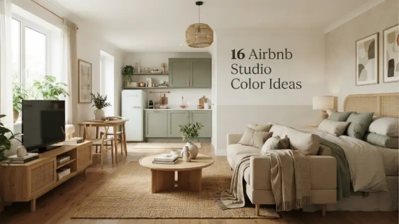
16 Airbnb Studio Color Ideas for a Modern and Inviting Look

Picking the right colors for your Airbnb studio can completely change how guests feel the moment they walk through the door. A studio is one open space, so every wall, every accent, and every piece of furniture works together to set the mood. The good news is you don’t need a huge budget or a design degree to get it right. You just need a few smart color choices that make the space feel bigger, warmer, and more welcoming than it actually is.
Below are sixteen color ideas that work beautifully in small rental spaces. Each one is easy to apply, guest friendly, and built to photograph well for your listing.
Why Color Choice Matters So Much in a Studio
In a studio apartment, there’s no hallway or separate room to break up bold choices. The kitchen, living area, and bedroom often share one wall or one line of sight. That means the colors you pick have to do a lot of work at once. They need to feel calm enough for someone to relax after a long day of travel, bright enough to show up well in listing photos, and neutral enough to appeal to a wide range of guests.
Good color planning also helps with something practical: it makes small rooms look bigger. Lighter shades bounce light around, while darker or busier palettes can make a compact studio feel cramped and closed in.
1. Warm White as a Base
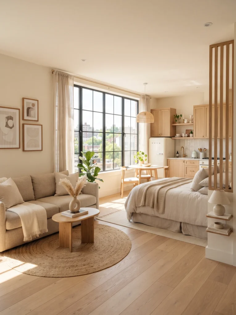
A warm white base is one of the safest and most effective choices for any studio rental. Unlike stark white, which can feel cold and clinical, warm white has a soft yellow or beige undertone that keeps the room feeling cozy. It reflects natural light beautifully and gives you a neutral backdrop for furniture, artwork, and textiles.
2. Soft Sage Green Accent Wall
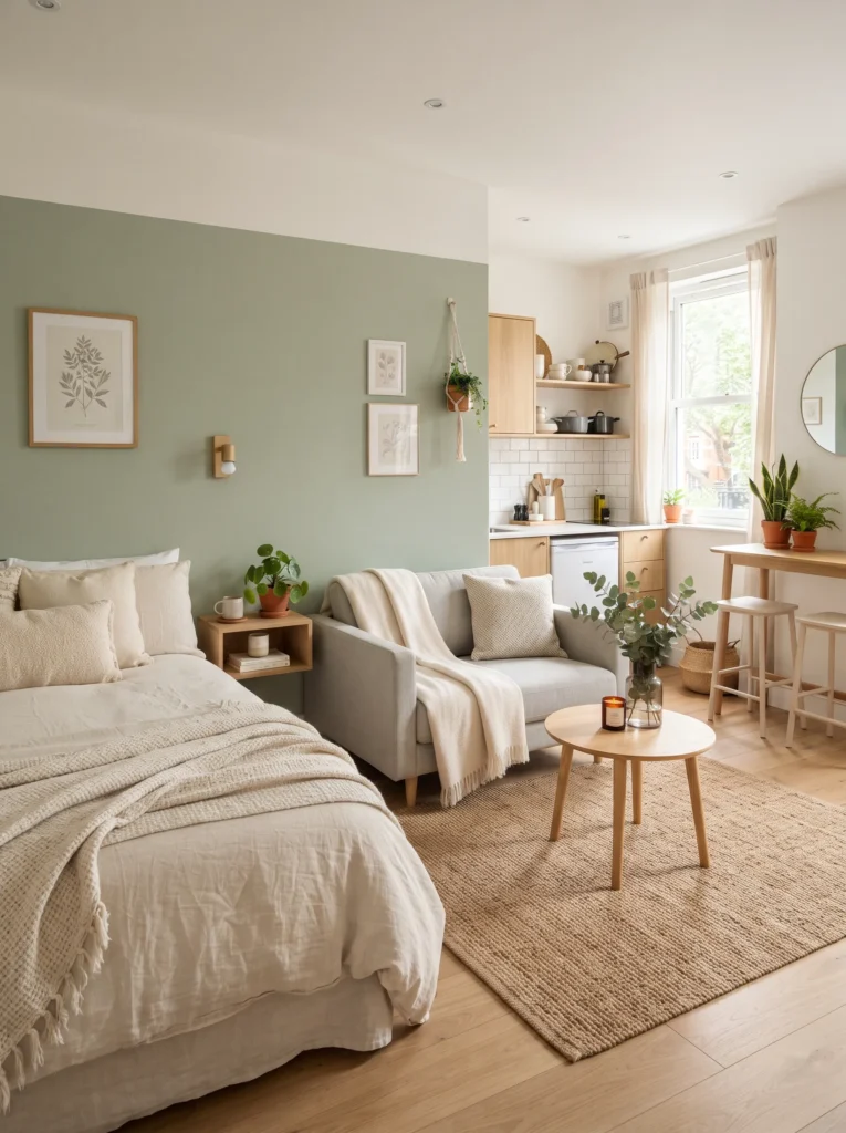
Sage green has become a favorite in modern interior design because it brings a calm, natural feeling without overwhelming a small space. Paint one wall behind the bed or sofa in sage green while keeping the rest of the room light. This creates a focal point without shrinking the room visually.
3. Muted Terracotta Touches
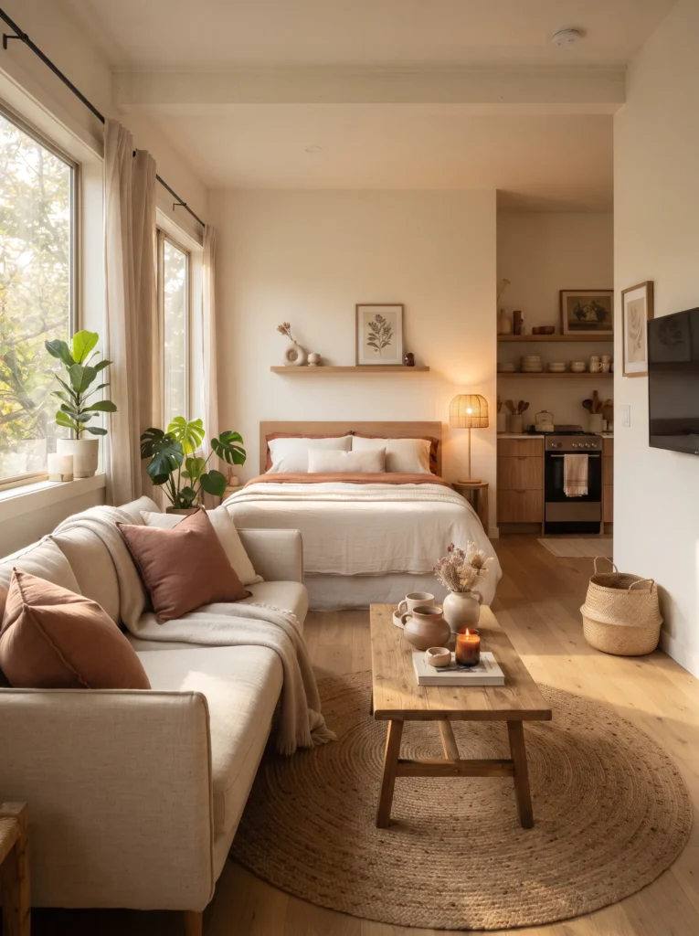
Terracotta adds warmth and personality without being loud. Use it sparingly through throw pillows, a rug, or a piece of pottery. This earthy tone pairs nicely with wood furniture and gives the space a grounded, homey feel that guests often mention in reviews.
4. Light Gray for a Clean Modern Base
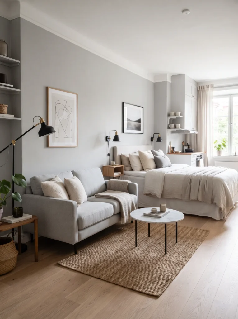
Light gray is a classic choice for a reason. It reads as modern and clean in photos, works with almost any furniture color, and doesn’t show wear as quickly as pure white. Pair it with black or brass fixtures for a sleek, contemporary finish.
Read More: 11 IKEA Studio Apartment Layouts for a Luxe Small Space
5. Dusty Blue for a Calm Bedroom Corner
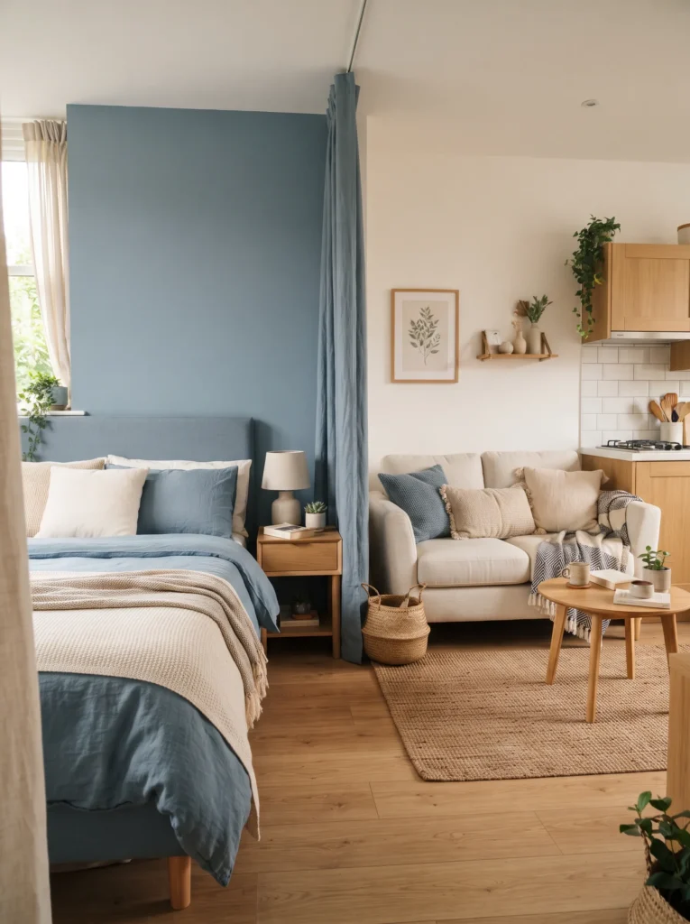
Since a studio often combines sleeping and living space, dusty blue is a great choice for the sleeping corner. It’s calming, sleep friendly, and softer than a bright navy. Use it on bedding or a headboard wall to gently separate the sleeping zone from the rest of the room.
6. Buttery Yellow for a Cheerful Kitchen Nook
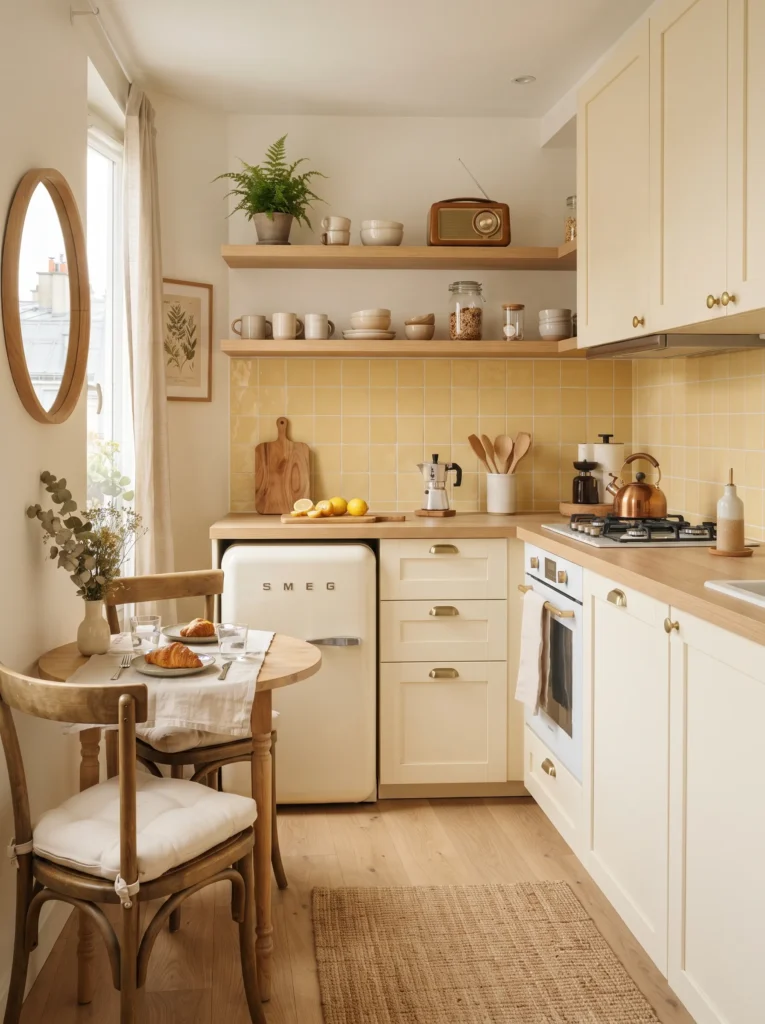
If your studio has a small kitchen area, a buttery yellow backsplash or cabinet color can make it feel bright and cheerful. This shade works especially well in spaces with limited natural light, since it mimics sunlight and lifts the mood instantly.
7. Charcoal Accents for Contrast
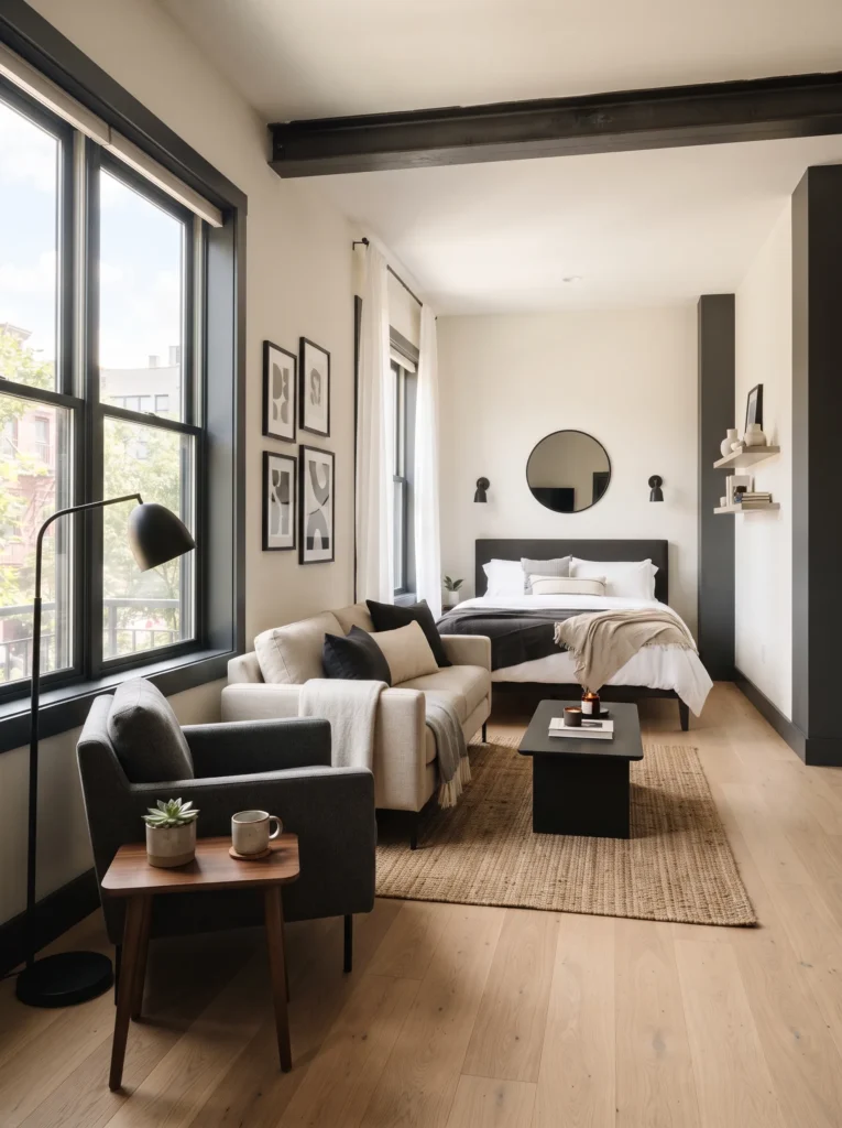
A little charcoal goes a long way. Adding it through window frames, a piece of furniture, or a feature wall gives the room depth and keeps an all light palette from feeling flat. It also photographs well against white walls, creating a nice contrast in listing images.
8. Blush Pink for a Soft Feminine Touch
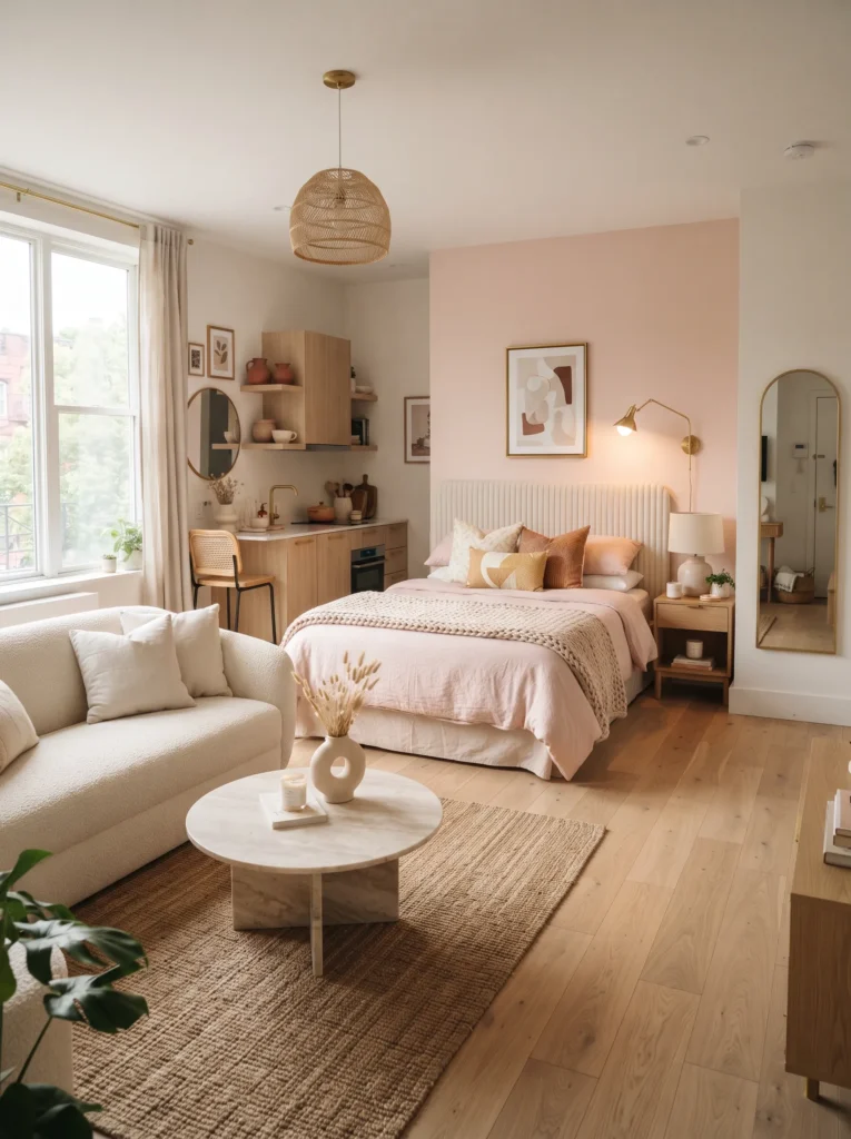
Blush pink has stayed popular for good reason. It’s soft, welcoming, and pairs beautifully with gold or brass accents. A blush accent wall or bedding set can make the studio feel like a boutique hotel room rather than a basic rental.
Read More: 19 Studio Apartment Decor Ideas Turn Room Into a Dream Home
9. Deep Forest Green for a Cozy Feel
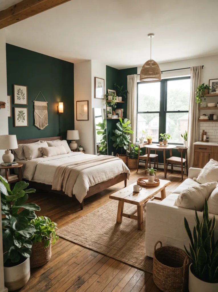
For a studio with good natural light, deep forest green can work as a bold statement without feeling too dark. It’s especially effective in spaces with plants, wood tones, and natural textures, giving the room a lush, retreat like atmosphere.
10. Cream and Beige Layering
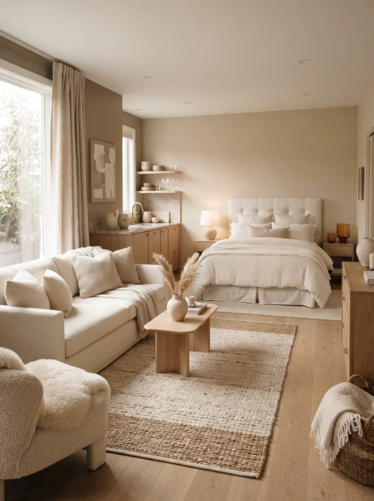
Layering different shades of cream and beige creates a rich, textured look even in a monochrome palette. This approach works well for guests who prefer a neutral, calming environment and it makes the space feel more expensive than it is.
11. Ocean Teal for a Coastal Vibe
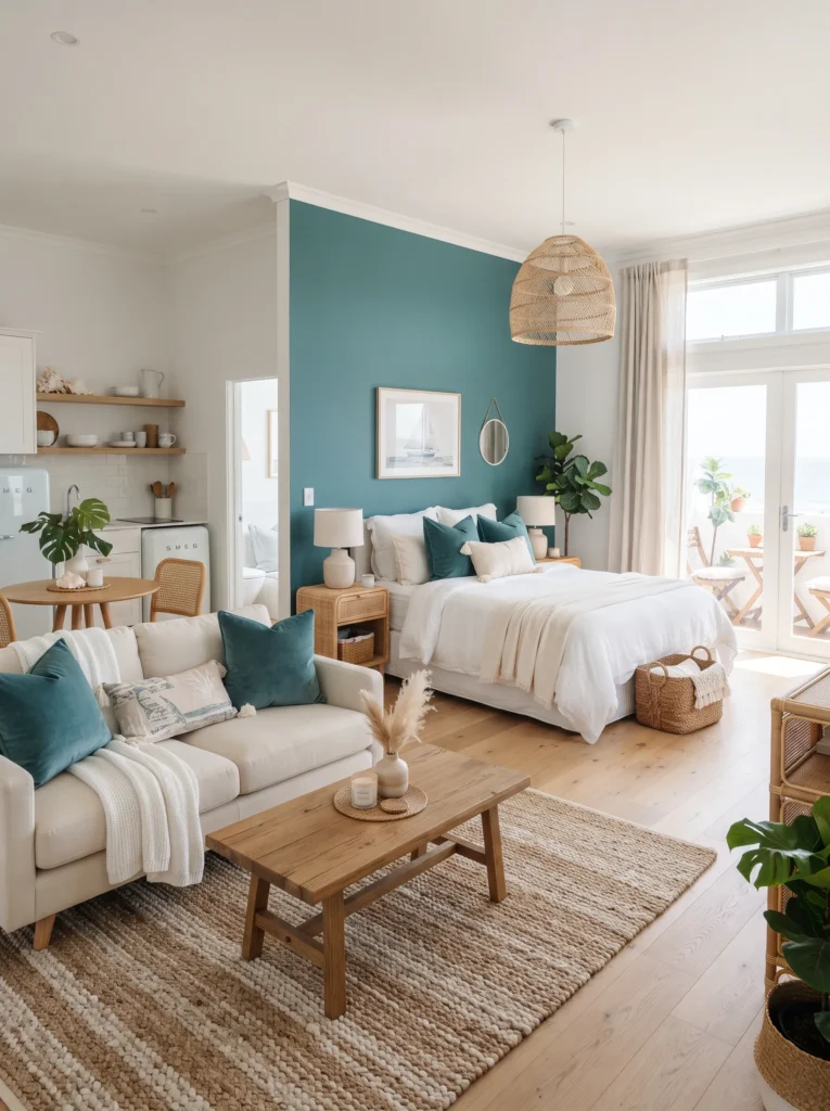
If your property is near water or you simply want a fresh, coastal feeling, ocean teal is a strong pick. Use it on one wall or through accessories like towels and cushions. It brings energy to the room without being as intense as a bright turquoise.
12. Soft Lavender for a Peaceful Retreat
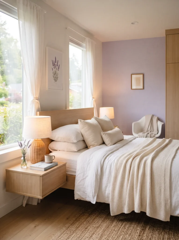
Lavender is often associated with rest and relaxation, making it a smart color for the bed area. A pale lavender wall paired with white linens creates a peaceful, almost spa like atmosphere that guests tend to appreciate after a day of sightseeing.
13. Mustard Yellow Accents
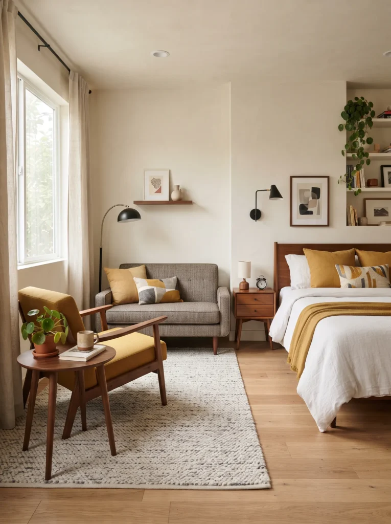
Mustard is a bolder cousin of buttery yellow and works well as an accent rather than a full wall color. Think a mustard armchair, cushions, or curtains. It adds a retro touch that pairs nicely with wood tones and black metal fixtures.
Read More: 23 Studio Apartment Storage Ideas That Look Stylish and Smart
14. Two Tone Walls for Visual Interest
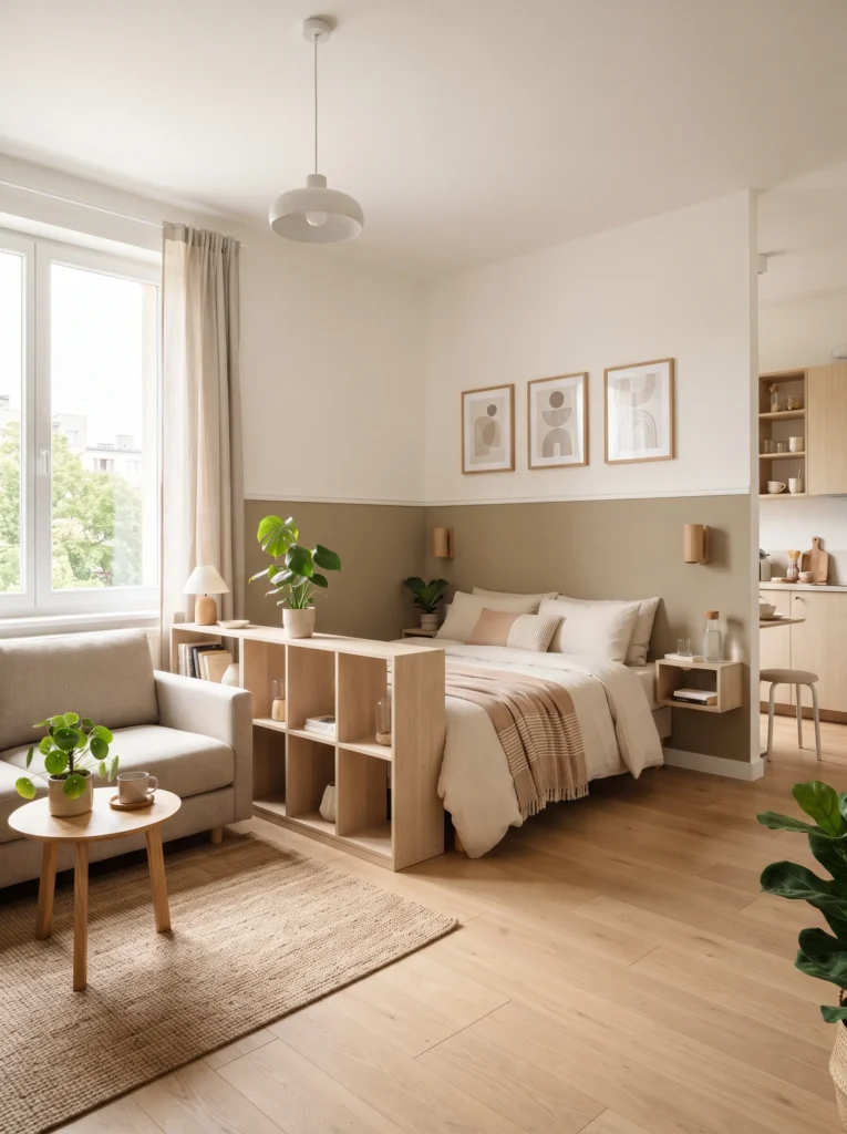
Splitting a wall into two colors, such as a darker bottom half and a lighter top half, is a design trick that adds character to a plain studio. This works particularly well behind a bed or sofa and helps define different zones in an open layout.
15. Black and White Modern Contrast
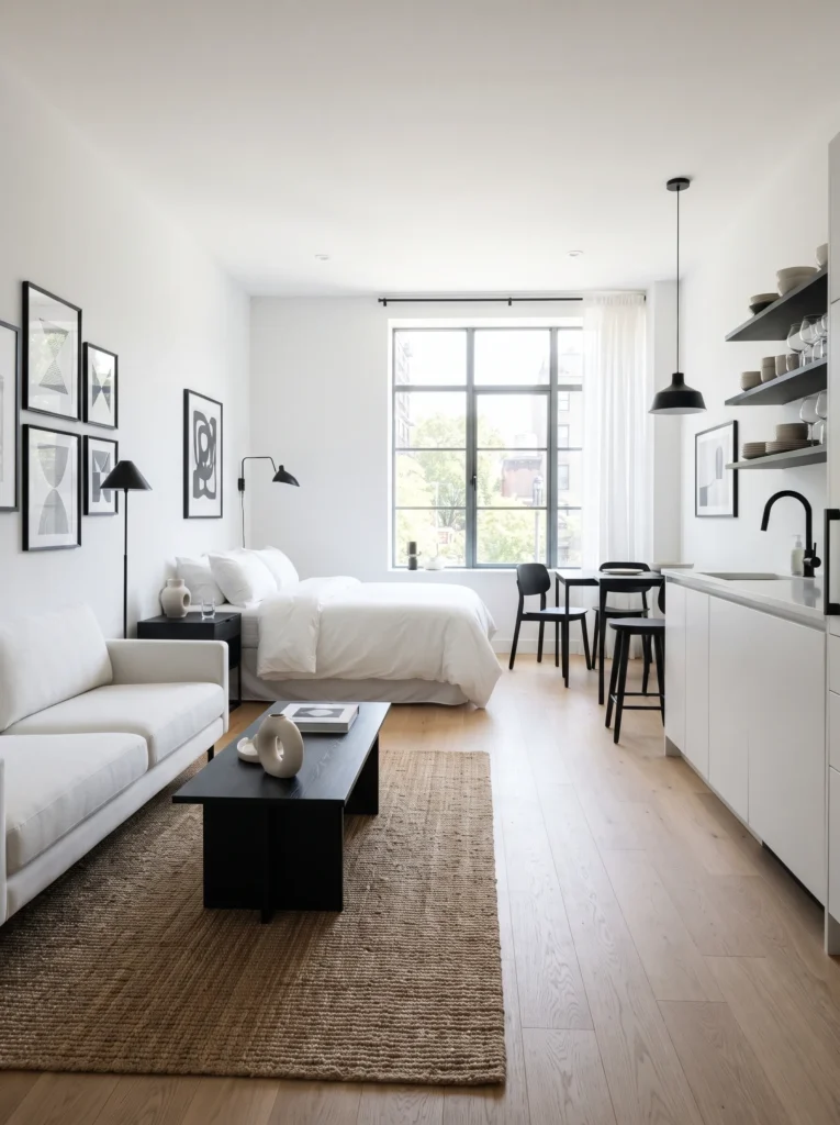
For guests who love a minimalist, high end look, a black and white color scheme delivers instantly. Keep walls white and bring in black through frames, lighting fixtures, and furniture legs. This combination always looks polished in photos and never goes out of style.
16. Earthy Clay Tones
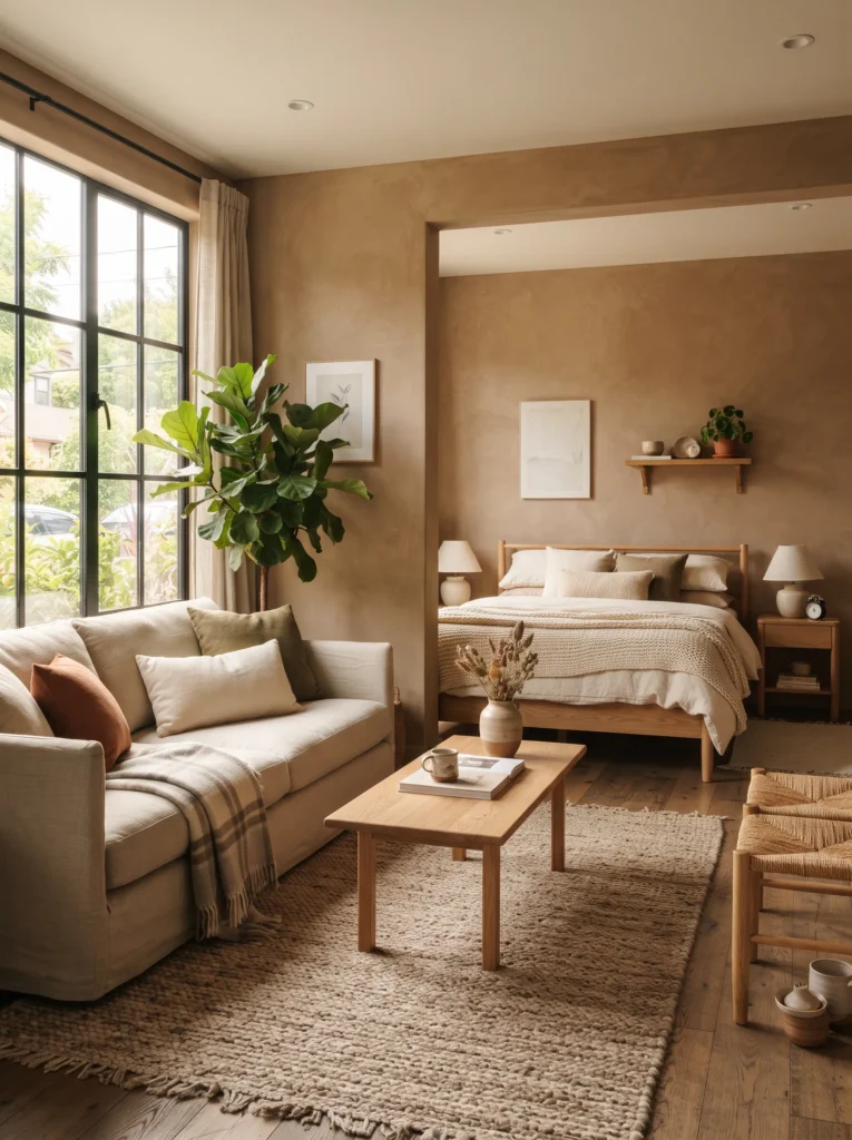
Clay tones sit between terracotta and brown, offering a soft, natural warmth. They work particularly well in studios with large windows since the color shifts subtly throughout the day depending on the light. Pair clay walls with linen textiles for a relaxed, organic feel.
Tips for Choosing the Right Combination
Picking one color from this list is a great start, but combining two or three thoughtfully is what really elevates a studio. Here are a few simple guidelines to keep in mind.
Stick to a light neutral for the largest surfaces, like walls and ceilings, since this keeps the room feeling open. Save bolder colors like forest green, mustard, or teal for accents, single walls, or textiles. This way you get personality without sacrificing the sense of space that guests expect from photos.
Lighting also plays a big role. A color that looks soft and inviting under warm bulbs can look completely different under cool white light, so it’s worth testing paint samples at different times of day before committing.
Finally, think about your target guest. A studio marketed toward couples on a romantic getaway might lean into blush pink or lavender, while one aimed at business travelers might do better with charcoal, gray, and clean white tones.
Final Thoughts
Choosing colors for an Airbnb studio doesn’t have to be complicated. The goal is to create a space that feels calm, current, and easy to relax in, all while photographing well for your listing. Go with a soft neutral base and a single bold accent, or layer a few earthy tones together, and either way small color decisions can make a big difference in how guests experience your space and how they rate it afterward.
Try one or two of these ideas in your next refresh, and you may notice the difference not just in how the room looks, but in how guests describe it in their reviews.